
Financial Institute
Create a sub-site for the company to display only Research-related content
Duration
Three Months
Role
UX Designer
Tools
Figma
Overview
This financial institute provides users with the latest articles and trends in the financial industry, as well as trainings on ethics and standards. The financial institute has a ton of resources and research content residing on their enterprise site. The issue is these resources are scattered all across the site, making it difficult for users to find resources in a timely and efficient manner.
Scope: Design a new experience where users can easily search only research related content, utilizing the existing pattern library.
Research Process
The first thing I did was review all the business requirements with my project manager and understand what it was we were really trying to address. I created questions to ask the stakeholders, consisting of managers and directors, to further refine the requirements. After these conversations were held, my project manager, fellow UX designer and I set out to conduct competitive analysis.
The competitive analysis was both significant and necessary because although the stakeholders had an idea of what they wanted, they didn’t have a clear vision of what the experience should look like. Additionally, due to a very short timeframe alloted, the team knew we couldn’t create the full end to end experience - so we identified three key areas to tackle.
Create a designated landing page that is specific to research
The current search experience is outdated, not optimal and needs a fresh look
The current article page template doesn’t optimize white space and the content is long
In addition to the competitive analysis, our PM looked at Adobe Analytics to identify what are the most searched research-related terms, which pages users visit and other important metrics.
Final Designs
Unfortunately, due to time constraints and lack of funding the project has been tabled until 2023. The following designs are the final versions we presented to the stakeholders.
*Additionally, due to a NDA, I’m unable to share the original content in the mockups.
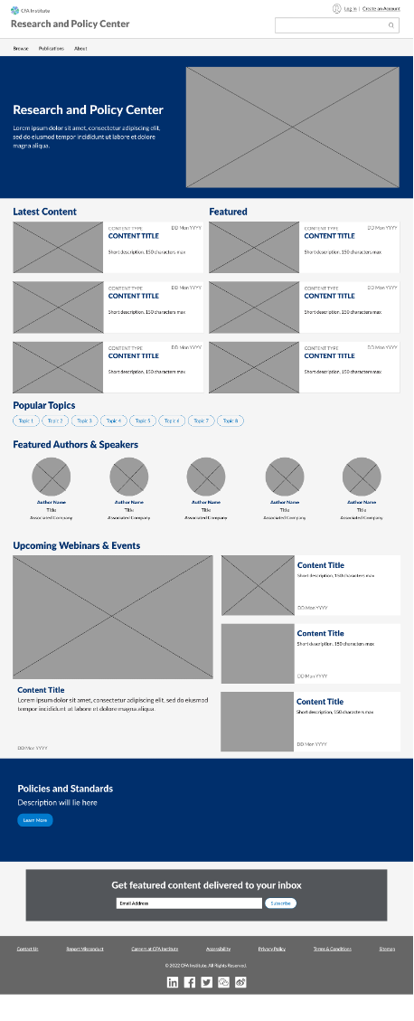
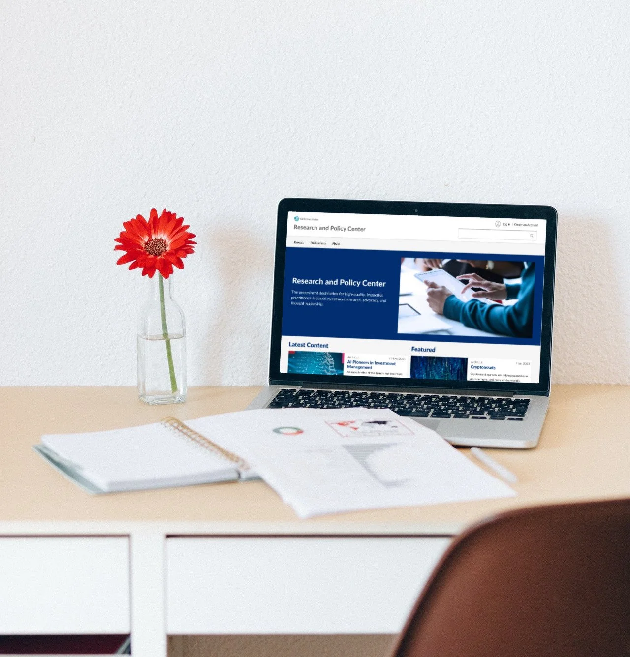
Landing Page
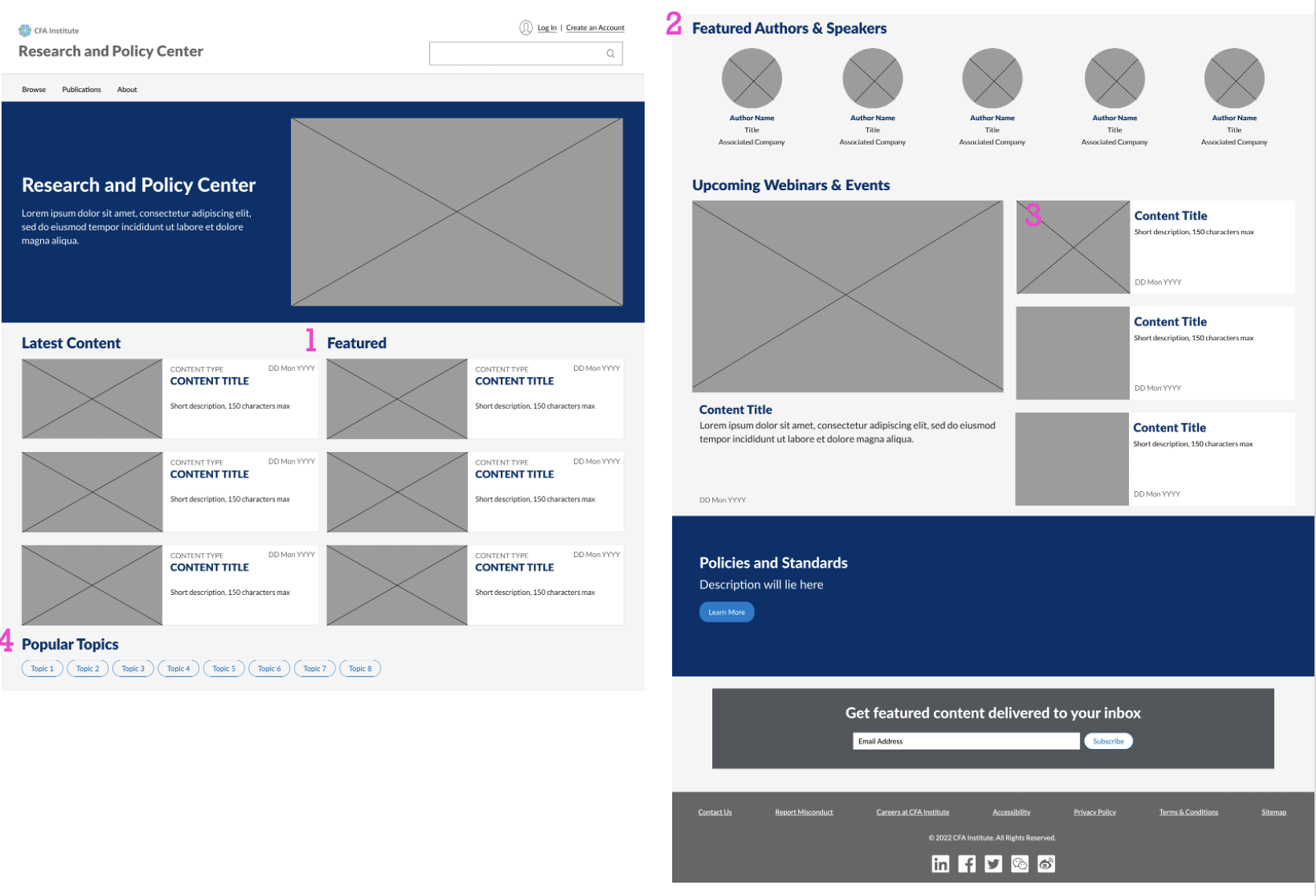
Featured content
Highlight key speakers
Short form content that provides a teaser into what else we can offer
Ability to search by popular topics
Highlight Policies and Standards for transparency reasons
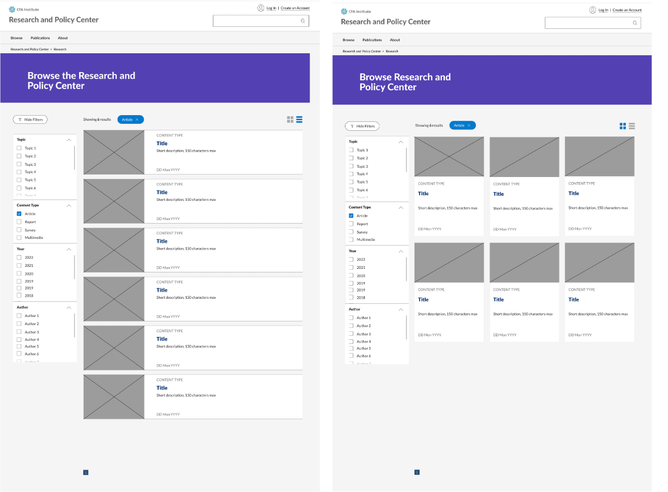
Search Experience

The search experience was a bit different than the home page because we have limitations from our vendor, Coveo. I read through the documentation available and determined I would focus on the following items
Ability to view results in card versus list view
Display dates on the cards
Show filters as pill buttons rather than hyperlinked text
Tags for “New” content
Push featured content to the top of the list
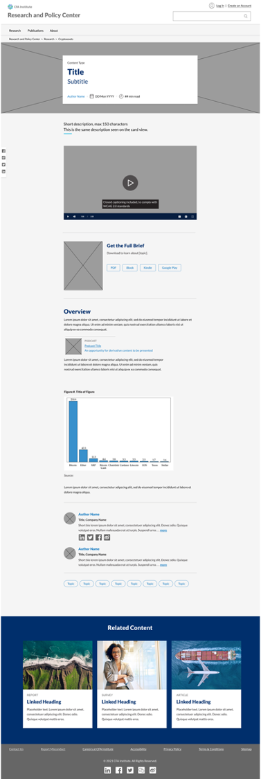
Article Page Template
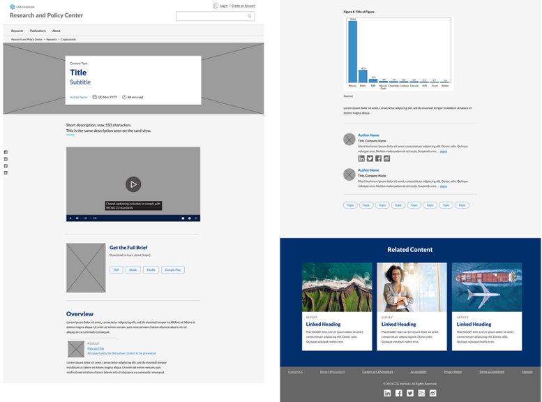
The need for a new article page template stemmed from the fact that white space was not used thoughtfully
Brief description should not exceed 150 characters max
Read time count, for visibility
An accordion menu functionality to show/hide long content
Showcase related content
