
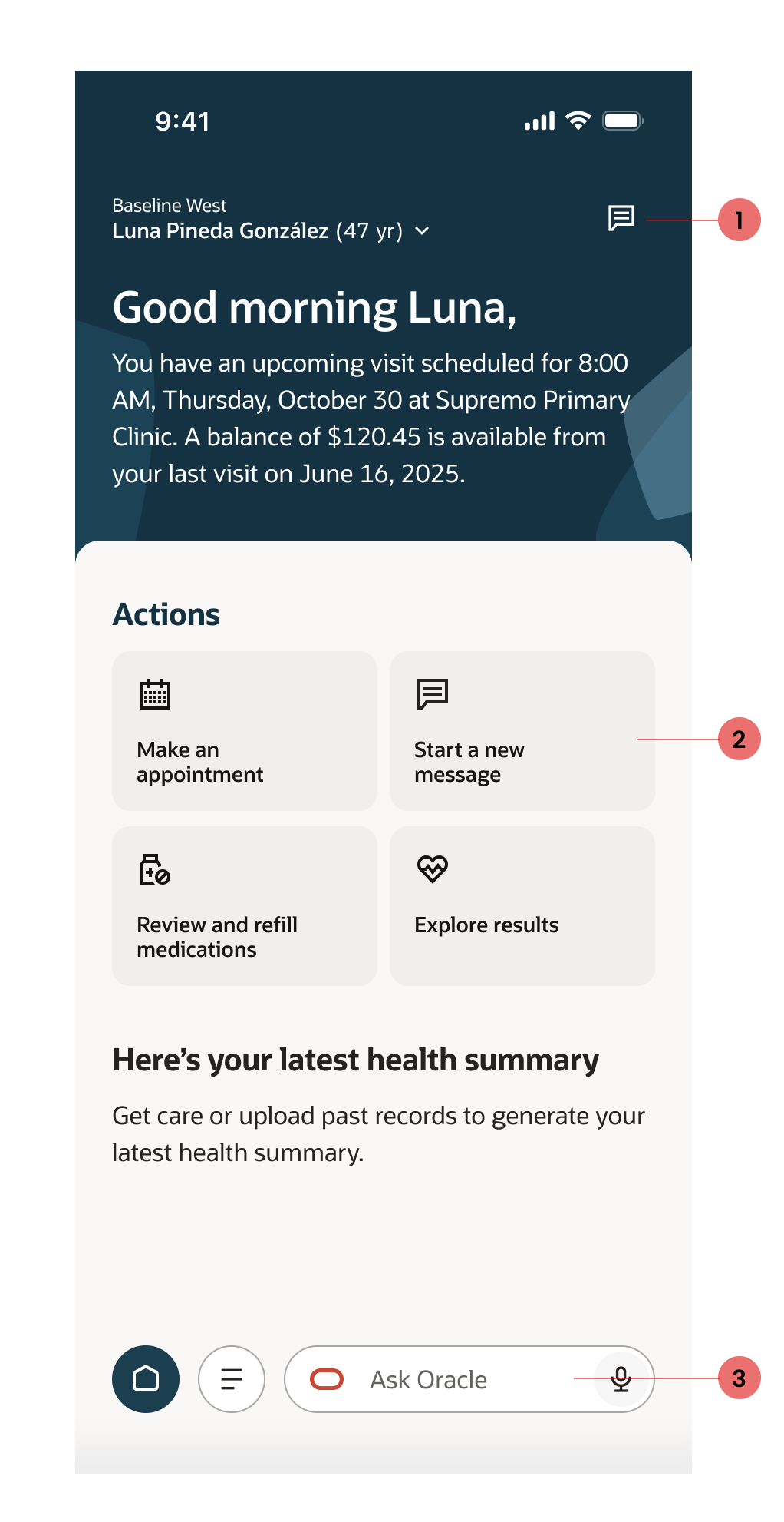
Patient Portal
Modernize and elevate a legacy patient portal messaging experience.
Duration
Two years
Role
Sole UX Designer
Tool
Figma, Figma Make
Overview
Health care has a notorious history of having outdated and suboptimal user experiences. In a world where people are being pushed to focus on wellness and health, doesn’t it make sense to provide users with the best? Best experience, best response times, and best practices in design to optimize their health?
One of the cool facts I learned was messaging is the #2 reason people use their patient portal. With that tidbit, it made sense to update the messaging experience so users can quickly communicate with providers, loop in caretakers or proxies into ongoing conversations, and even tap into AI for assistance.
Scope: Elevate the legacy messaging experience, focusing on a modernized mobile-first experience.
Design Process
Over the past 3 years, I collaborated with our Human Factors Research team to comb through a plethora of research materials and user testing data, and understand what our users are looking for. The research validated some notions we already had: the legacy messaging experience was outdated, hard to navigate, and very slow.
As a cross-functional team, Research x Design x Product met multiple times a week to create personas, user goals and scenarios focused on pushing the limit of our designs. There were several iterations that focused on different goals, which I have shared below with annotations.
Iteration 1
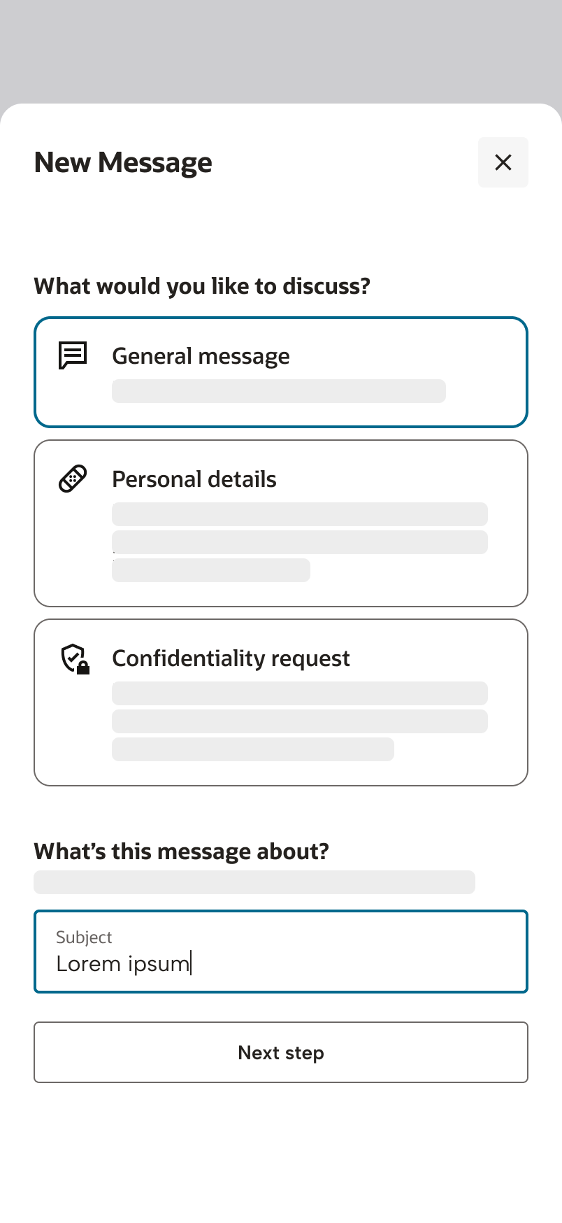
Simplify and clarify what type of message the user should select in the new message workflow.
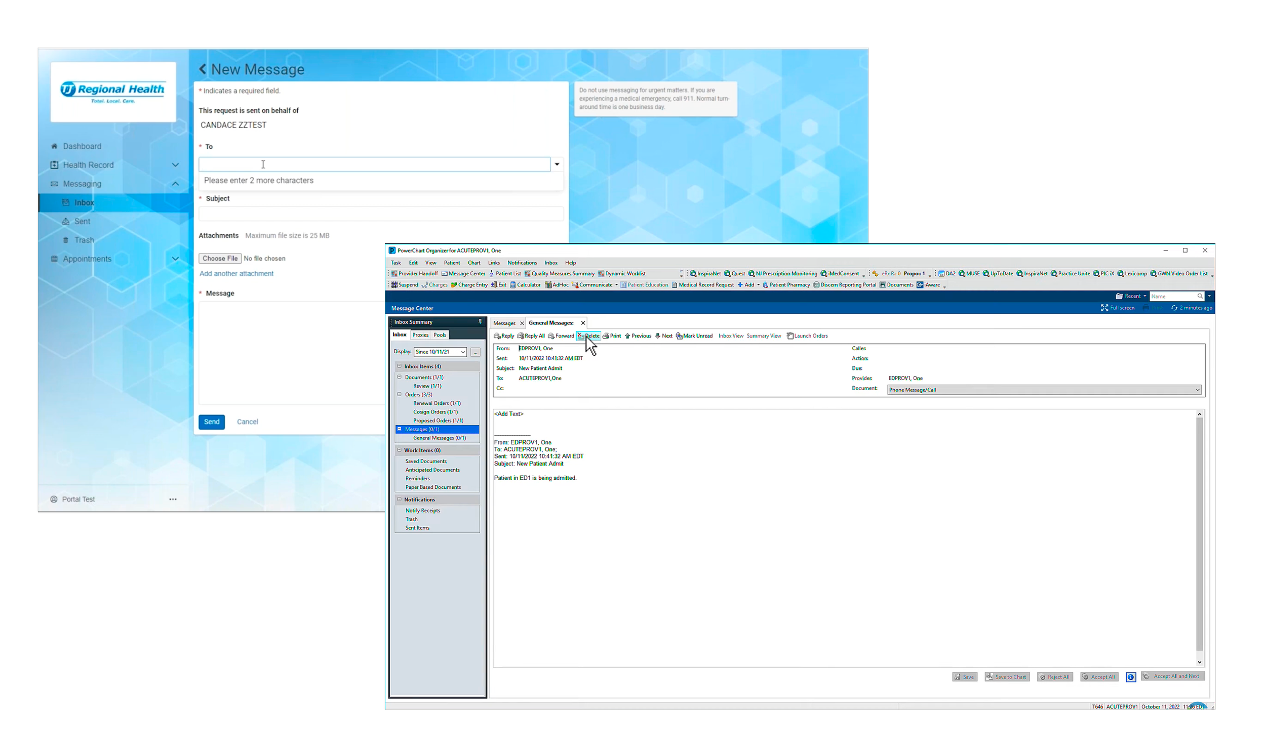
Usability tests told us having a dropdown of message types was confusing for the general public and actually led to users inundating their provider’s inboxes with many messages!This told me users do not understand what these generic message types mean - for example, what does confidentiality request really mean?
In this iteration, the team explored the idea of creating a guided workflow to include more descriptions of what each option means, and also aligned with the general model we created in other parts of the portal. I worked with our technical writer to ensure we aligned with Oracle’s standards and providing detailed descriptions.
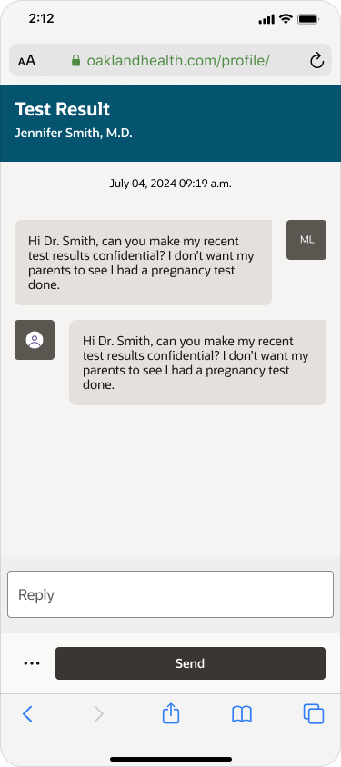
As you can see in the screenshot to the left, the legacy platform was desktop-first and only allowed for single message responses; meaning the user would have to actively switch to their “sent” folder to remember what the previous message said. Additionally, each message sent or received was listed as an individual item, creating a lot of bloat in the user’s inbox.
Our goal with the first iteration was to:
Align with Oracle Design standards, which makes our designs scalable and easy to update.
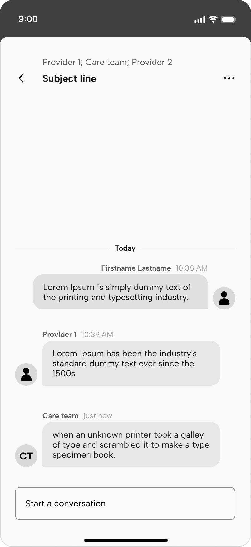
Move away from the plain text, email format towards a chat bubble-style message thread.
I pushed hard on threaded messaging to not only alleviate bloat, but it also gives the user context and groups all related messages of a single subject.
Iteration 2+3
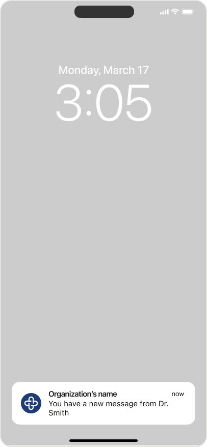
The next changes we prioritized were supporting different types of messages, such as medication renewals, and making the designs more mobile friendly. We also got a push from leadership to start designing for an iOS mobile app version of our patient portal. With this, we also worked on push notifications that deep link users into the message thread; reducing clicks.
My team lead and I also wanted to link specific message threads to related pages, like a test result or an upcoming appointment detail page. Unfortunately we could not agree upon the mental model when presenting the idea to leadership. Ideally, with this model in place no matter where the user creates a new message, it would follow you as you navigate across the portal.
Iteration 4
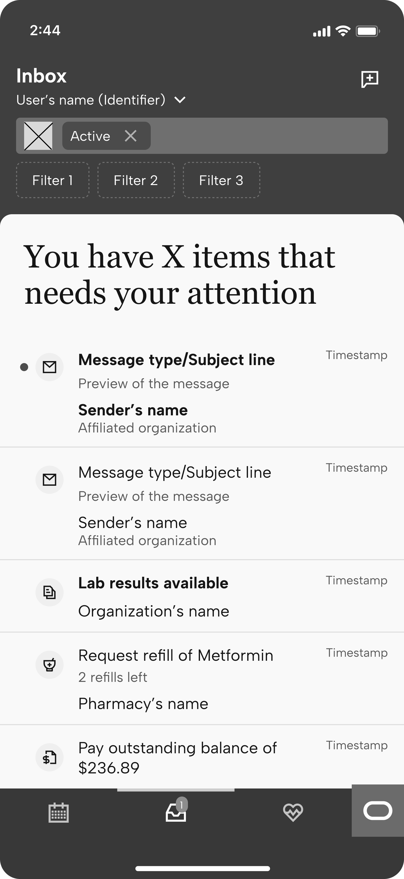
With the third iteration in GA, the team was able to gather some analytics and found a few pain points to improve:
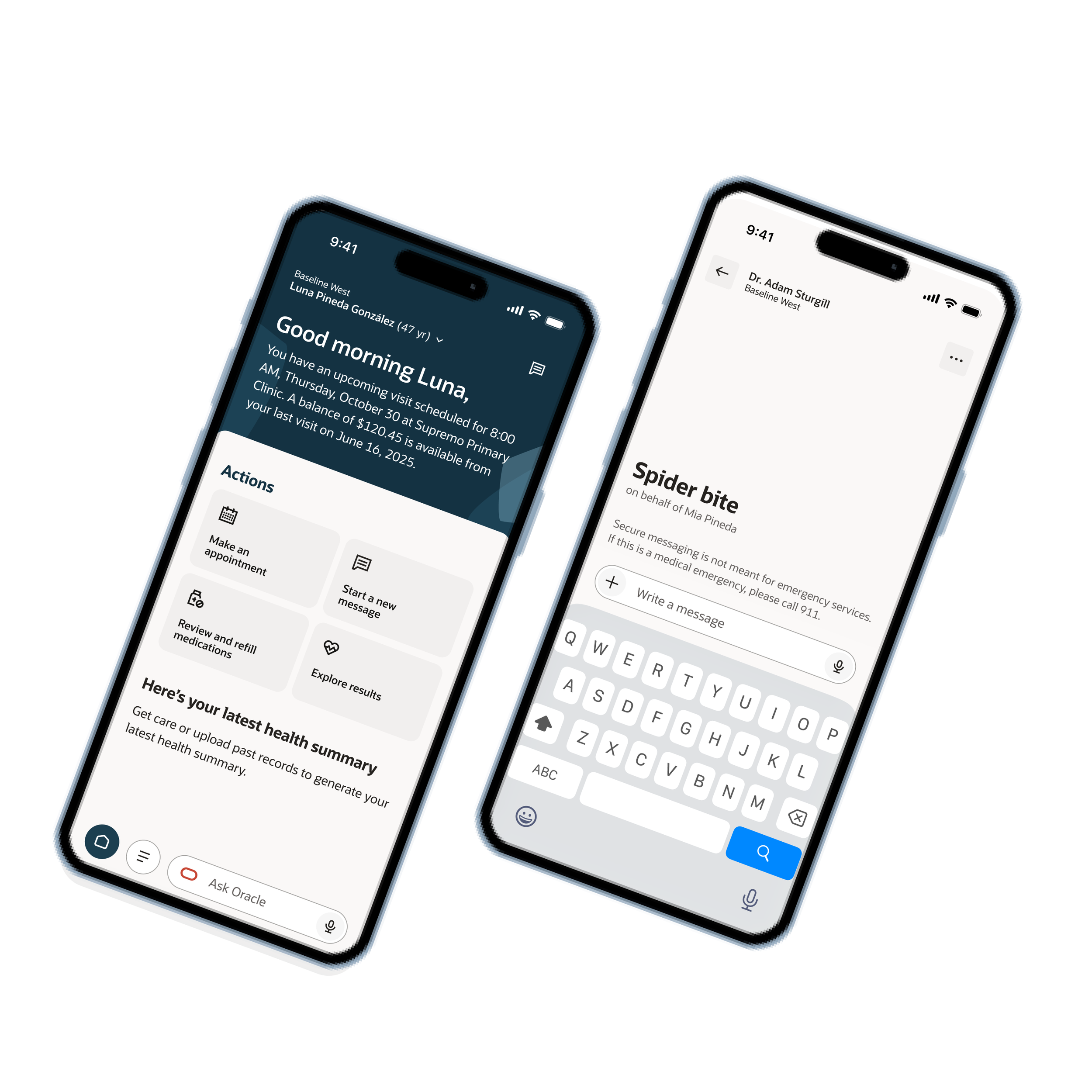
Provide quick links to create a new message
This one was easy to solve - with the guidance of our research team, the team decided to have a sticky header with a “New message” button that can be found anywhere across the portal. We also made this a quick action on the homepage, as research informed us sending messages is the #2 reason users come into their patient portal. Finally, the user can ask Oracle assistant to create a new message, which would redirect the user to the workflow.
Iteration 5
The last iteration I worked on was expanding on the previous iteration and seeing how we can integrate AI into the model.
Due to our NDA, I’m unable to share the designs we worked on. However the general concept was to alleviate the user from having to make too many decisions. Why should the user be burden with selecting a message type or the recipient, when all they really want is to quickly get in touch with their provider and get answers. What if we used AI to gather those pieces of information, craft a message and even determine who is the correct recipient.
We explored this option and even looked for ways to introduce educational materials early in the user’s message thread. The purpose of doing this was to hopefully answer the user’s question and reduce the number of messages the provider receives.
It was truly a shame I couldn’t work more on this project, but I’m so thankful for the opportunity I had to work with our AI team in the end! It was such a fun project and have so many more ideas I wish I could have shared with the team.